Updates for April
Reflections after a fantastic convention experience on how I present my published work.

CycloneCon was a wonderful experience. I got to spend the day with a tremendous group of authors, discussing craft, business, and pop culture throughout the day as Centenary University students and other con-goers took the time to meet us, peruse our books, and ask awesome questions. This is an event I would gladly do again, as the staff of the con really did everything they could to make this a wonderful experience for vendors and guests alike.
With that said, certain things became clear to me that I couldn't really ignore.
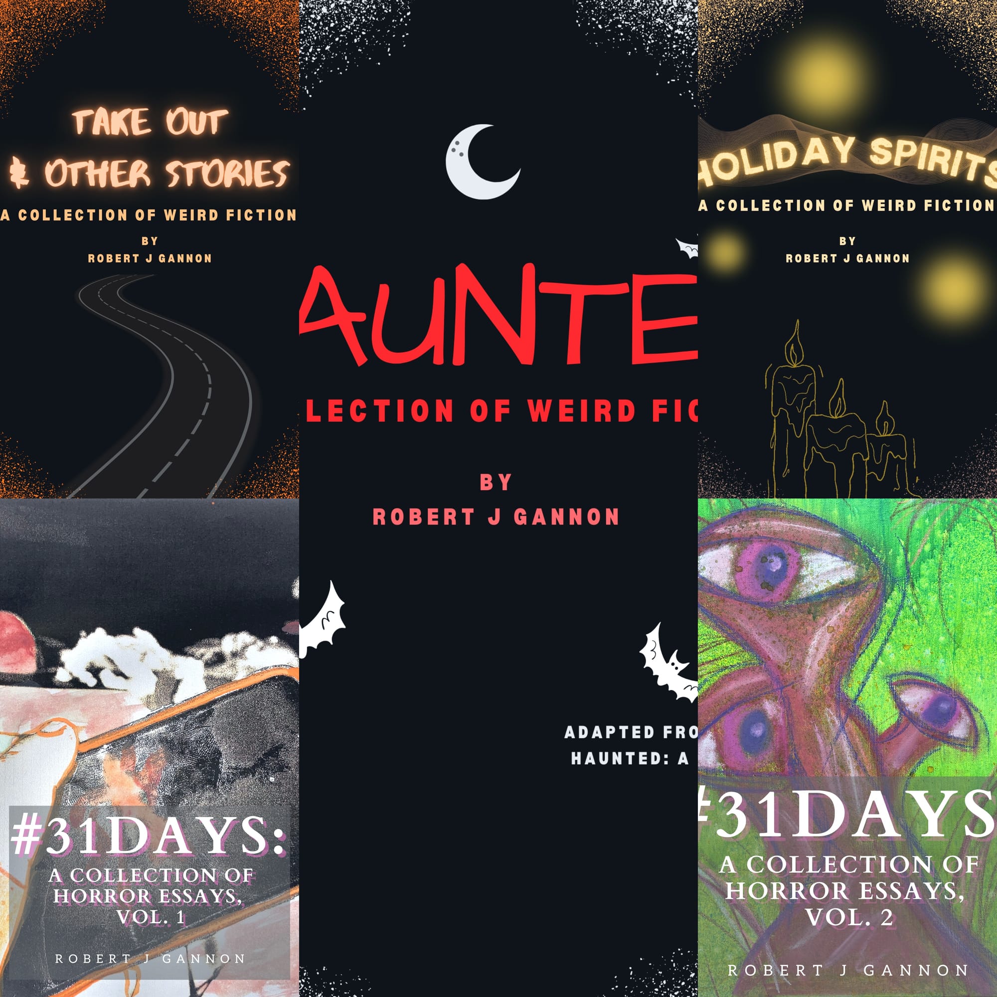
Ever since I started bringing my books in person to events, I've noticed that two titles drew more interest than the others. I've had to order multiple print runs of Haunted and #31Days: A Collection of Horror Essays, vol. 2 after events. Sure, the other books sell to, but these are the titles people gravitate to. I know we learn that you can't judge a book by its cover, but we can learn that certain covers draw more attention than others.
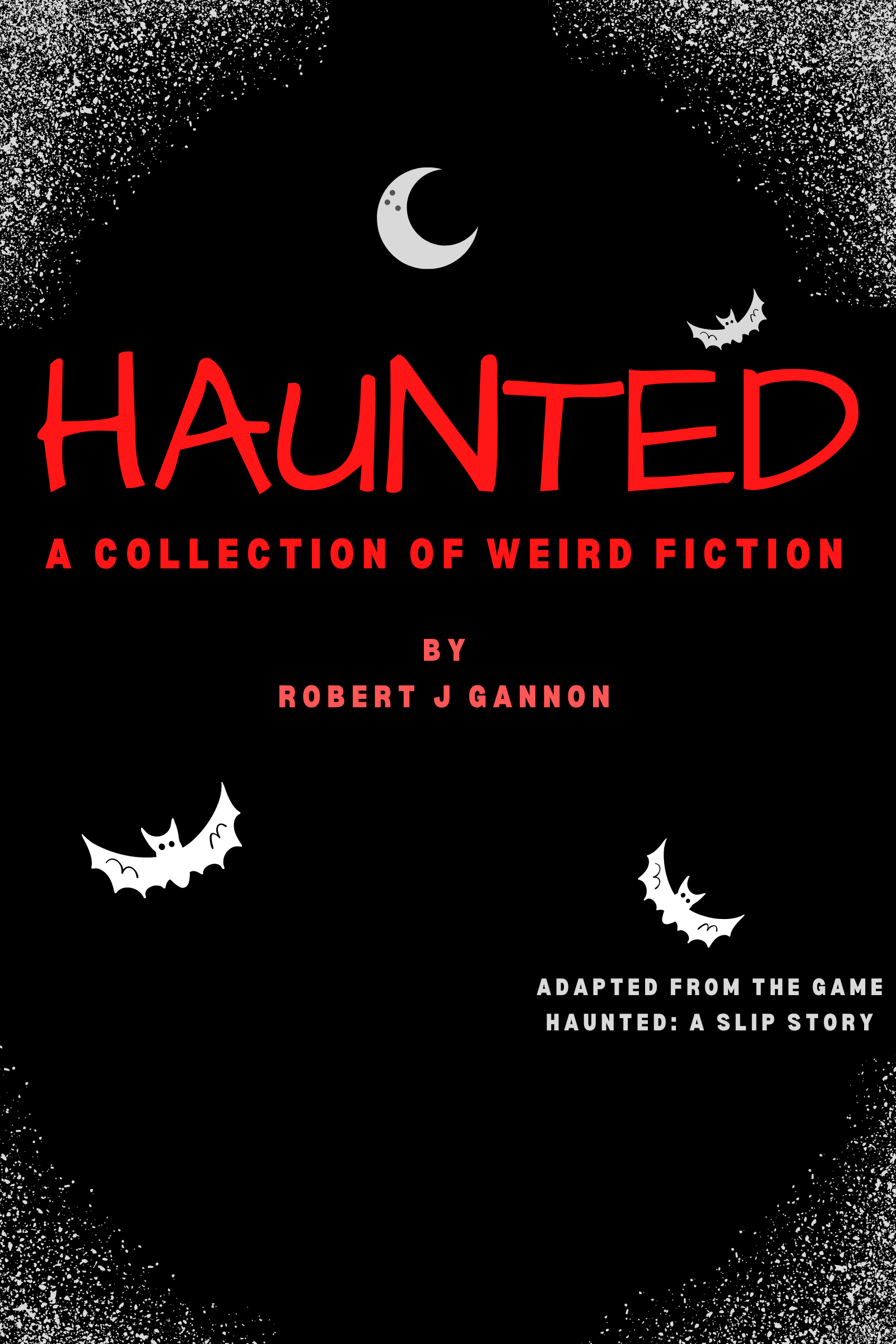
Shocking, I know, but my totally indie self who does everything designed all the book covers, art, and graphics associated with Sketching Details. The almost-8bit style of Haunted was selected because the project started as a video game, then grew to a book adaptation as I obsessed over the concept while working through grief. People love this book cover, and so do I.
That does not mean I do not love the original covers for Take Out and Holiday Spirits; I adore them. Take Out is a fantastic photograph I painted over digitally of one of my favorite home haunts, and Holiday Spirits is a tribute to my family's love of Christmas. However, if I have to shift to a more consistent style between the three collections, I'm going with the style that sells. Here is the new book art for Take Out and Holiday Spirits. I'm kind of in love.


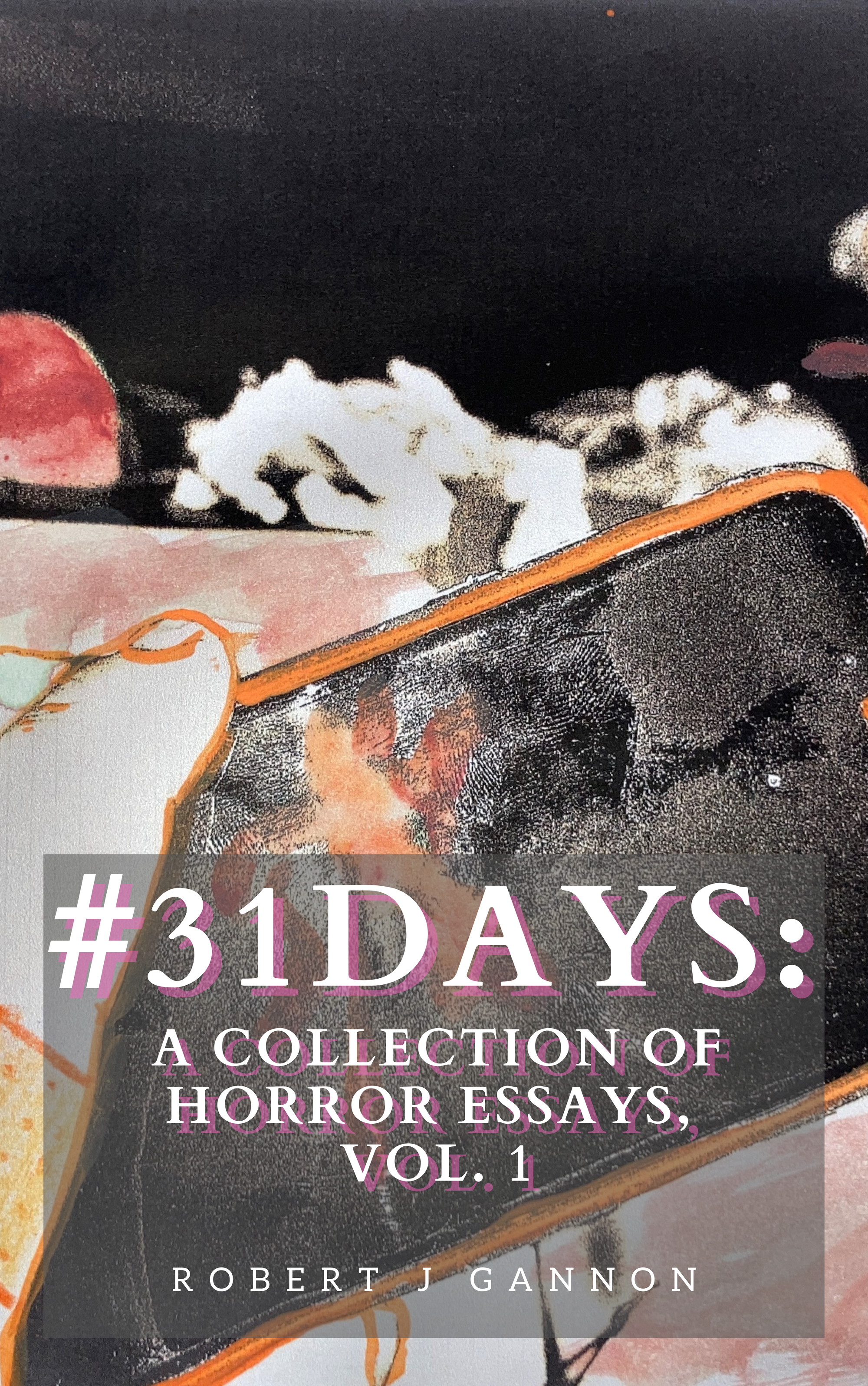
As for #31Days: A Collection of Horror Essays, vol. 1, I get it. I love my original cover, but I can't ignore how striking and scary my original art is as a warning for a book of horror criticism.
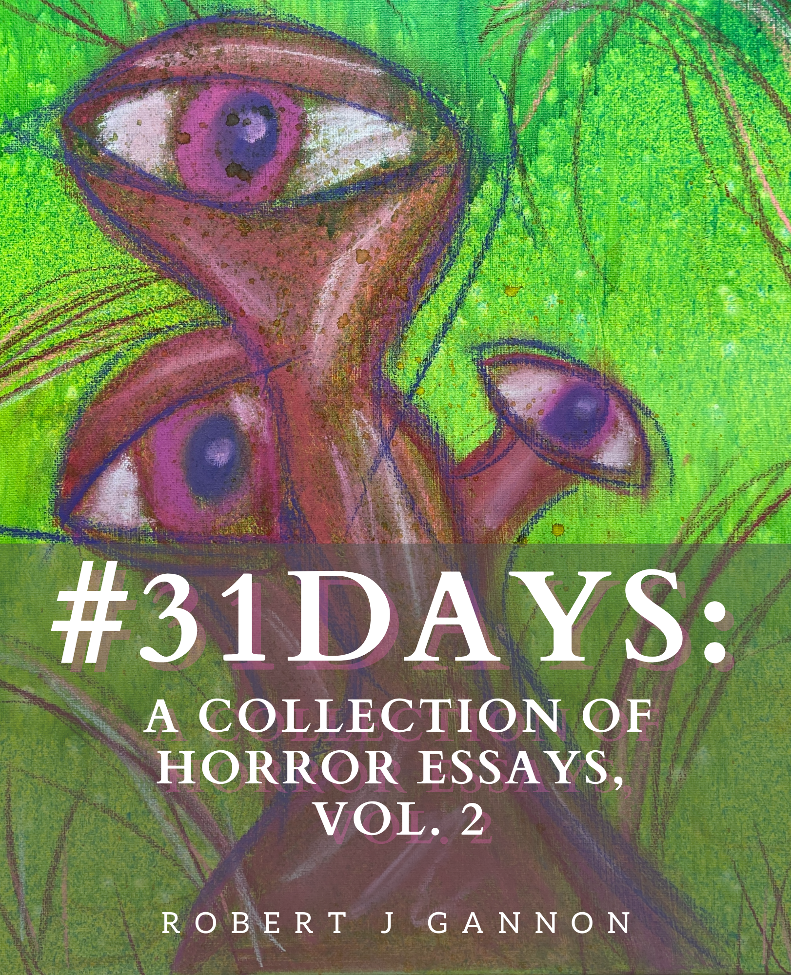
I pulled through my back catalog, settled on some game assets from Haunted: A Slip Story, and matched the title/author font and placement from vol. 2. Now that's an attractive set. The next step is fighting through the publisher's interface to actually get them printed at the same size. People prefer the size of vol. 2, though that being a different size at all was a publisher error, not my decision. Still, I'd rather update the old to what the people want than mess around with the new one people prefer the size and style of.
Me? I'll read a printed out zine with faded ink and rank it among my best books of the year. I'm here for the experience of the writing, though I get that pretty packaging is a reality of capitalism.
The covers are all updated on the major platforms. I still have to go through and rebuild the cover files for the Ko-Fi releases (where I get all the profits, hint hint) but that will have to wait until after I meet my grading/professional duty deadlines this week. Spring break is imminent and I'm ready to rest and obsess over my own work.